Reimagining the mobile app for the Museum of Fine Arts Boston
Case Study
How would the MFA design and build a new mobile application that would encourage visitation to the museum while increasing user engagement and enjoyment digitally, as well as enabling it to create additional lines of revenue to financially recover what was lost due to Covid-19.


Timeline
80 hours, Apr 2022 - May 2022
Company
Museum of Fine Arts Boston
End-to-end UX/UI Designer. Research, wireframing, prototyping, visual design, user testing
My role
Tools used
Figma, Miro, Whimsical
The Museum of Fine Arts (MFA) Boston was one of the 90% of museums globally that shut its doors due to the Covid-19 crisis. Having been closed for over 6 months during the pandemic, the MFA lost millions of dollars and was able to stay afloat financially in large part due to philanthropy. Their current mobile application only has three features, pre-existing audio tours, audio descriptions with transcripts of artworks, and basic maps of the grounds. The goal of the project is to provide a more extensive educational experience for guests, a more efficient navigation system, and introduce a way for the museum to capitalize on NFTs.
Research
Research methods used
I conducted secondary research and competitive analysis to better understand the features available on different mobile applications used by museums and who the target user base for my application would be.
Individual interviews were conducted both in-person and remotely over Zoom in order to gain better insight into needs, wants, frustrations, motivations, and other observations from semi-frequent to frequent museum visitors as well as their experiences taking tours and using museum accompaniment applications.
Sample of questions and answers

Q: Thinking back to the last time you visited a museum, did you do research beforehand?
A: I think one of my friends did. We looked up how to get there and if it was open. I think one of them looked to see if there were any interesting exhibits and there were which is why we went to the MoMA instead of like the Guggenheim or the Whitney
A: If there's a new exhibit coming I tend to check it out and know what to expect. There's a museum I've been meaning to get to, the Isabel Stewart Gardner Museum, I've been to the MFA a bunch of times but want to look up the museum before I go
Q: If you were to download an app for the most recent museum or exhibit you went to, what sorts of information would you use it for?
A: Like a guide, a guided tour that knew where you were and told you about what you're looking at. I think that would be useful. If the app could tell me about upcoming events or guide me to the part of the museum I am looking for, like Waze. That would be neat. Like in 80 feet take a left. Or finding stuff in the Museum of Science, which is chaos with so many wings and can be tough to find what you’re looking for
A: Map, a searchable map. Or a self-guided tour, like it's not like here's how you HAVE to go through the museum. How do I follow my own interests to see what I want to see. I would like to be able to save art I liked too I think
Notable insights from my research
100% of participants interviewed said maps or guides would be the most important feature in a museum application with one participant specifically mentioning that museums tend to be huge and confusing
Every competitor application I looked at showed currently displayed collections and descriptions and most of them included audio guides
66% of participants interviewed mentioned not taking museum tours due to being too restrictive and not catering to their interests
100% of participants interviewed said they do research online from home before or after their trips to the museum to look up what is on display ahead of time, purchase tickets or view hours, or they take photos and write down names of artwork while at the museum in order to learn more or use as inspiration in their own lives
Changing direction
What had initially started as a project to create a Duolingo type feature for this museum accompaniment app that would help teach users more about art, artists, and art history began to instead focus more on enhancing the user’s experience within the museum and creating a more functional application outside of the museum. Through my research, I discovered that the problem I was initially trying to solve, how to provide an educational experience for adults and children in an interactive application to increase overall enjoyment within the museum, didn’t affect many people. Therefore, I shifted my focus to be more inclusive and tackle more pressing issues presented by Covid-19.
Define
I took an iterative approach to this project. I gained feedback through the project that made an impact at each stage of the process.
For the information architecture stage of this museum application, I created a user persona, some initial sketches of the homepage, a sitemap, user flows, and low-fidelity wireframes.

Design
For the first iteration of this app design, I stuck closely with the existing MFA brand UI guidelines in order for it to feel like a natural extension of the museum. This was everything from the color scheme and typeface to the sharp corners of buttons and images.
After early feedback, I decided to adjust my design to feel more modern with an updated color scheme, typeface, and other UI elements.
Audio tours
Through both individual research interviews and research on competing museum accompanying maps, I realized that the MFA could benefit from self-guided audio tours. Their existing app only had, at the time of writing this, 6 available audio tours for specific exhibits but they do have audio transcripts for much of the museum’s artwork. I wanted to allow users to create their own audio tours using these existing audio transcripts so they would be able to select and learn more about the art and artists that they are most interested in. The user would select any number of artworks they would want to add to their route and the app would automatically arrange the stops to be most efficient for the guest based on their gallery room numbers.

Navigation and maps
Another problem with the existing application that was also brought up in individual interviews, was the lack of functionality in the museum maps. I wanted to take what had been a two-dimensional map of the premises and create something similar to Google or Apple maps that would be able to provide step-by-step directions within the museum. This would alleviate confusion in the large museum space and would help guests to get to the next stop on the audio guide. I included a save feature that would allow guests to save their favorite artworks and locations directly on the map for future reference.

NFTs
Having the museum sell NFTs was an idea that came from research into other museums. By allowing users to purchase a limited edition NFT of one of the museum’s artworks, the museum would be able to add another source of funding and encourage more visitors to the museum. The guest would physically go to the artwork’s location and scan it to unlock and purchase the NFT. This would also give users an incentive to use the scan feature in the application. Aside from buying and NFT, scanning an artwork would also pull up its description, the audio guide, map location, share and save functionalities, and a 360° panorama of the room it’s located in.

Test
I created a functional prototype with which I conducted 3 usability tests of 4 scenarios for the application’s essential flows
Goals
Determine if this app provides value for MFA visitors that may otherwise skip using an app in a museum
Evaluate the interactions the users have with the MFA application, identifying current pain points, potential pain points, and successes of the main user flows, architecture, and design
Gain insight into how and why users would interact with the app
Priority Revisions

Before and after testing

Problems based on feedback from users
Some of the biggest issues participants had during the testing came from confusion over the footer icons, stalling the completion of scenarios early on in the testing
Solutions to these problems
Updated the footer navigation to provide more clarity for users by adding labels and replacing the NFT icon with one that is both more recognizable and fitting in with the style of the other four icons
Before testing
Problems based on feedback from users
The maps feature and the 360 panorama feature did not provide as much functionality as the participants would have liked and left a lot to be desired
After Testing

Solutions to these problems
Included more functionality and features within the maps and 360 panorama screens for greater user engagement and enjoyment, such as being able to save locations and artworks within the map and 360 panorama views of rooms. I also included a way to click on artworks within the 360 panorama to pull up more details.

Before testing
Problems based on feedback from users
All participants had similar questions regarding the NFT user flow, but the oldest participant had more difficulty completing the flow due to a lack of clarity about how to unlock them
After testing

Solutions to these problems
Added more information throughout the NFT flow to provide users with greater clarity as well as tagging locations on the NFT map with the names of the artworks
Reflection
This project was the biggest challenge I’ve had so far in my UX/UI journey, as I had to create an entire MVP for a mobile application with complete creative control. It took me many revisions and iterations to come up with an interesting user interface and exciting features that could follow current design trends. I felt imposter syndrome the most intensely I had in months, constantly doubting my ability to create something of value. In the end, I think the app I designed does a successful job of reimagining the Museum of Fine Arts Boston’s current mobile application with more exciting features and a revamped user interface design that users would be able to use both in and out of the museum. As with most things, there is still more work to be done. Future revisions include building out the favorited works feature, further expanding upon the maps feature, and designing the users’ profile screens. After these revisions, I would then conduct further usability tests.
Title Screen

Home
Audio Tour Selection
Museum Maps
Audio Guide
Audio Tour Next Stop
Walking Navigation
NFT Home
Hours and Admission
More Projects
Previous
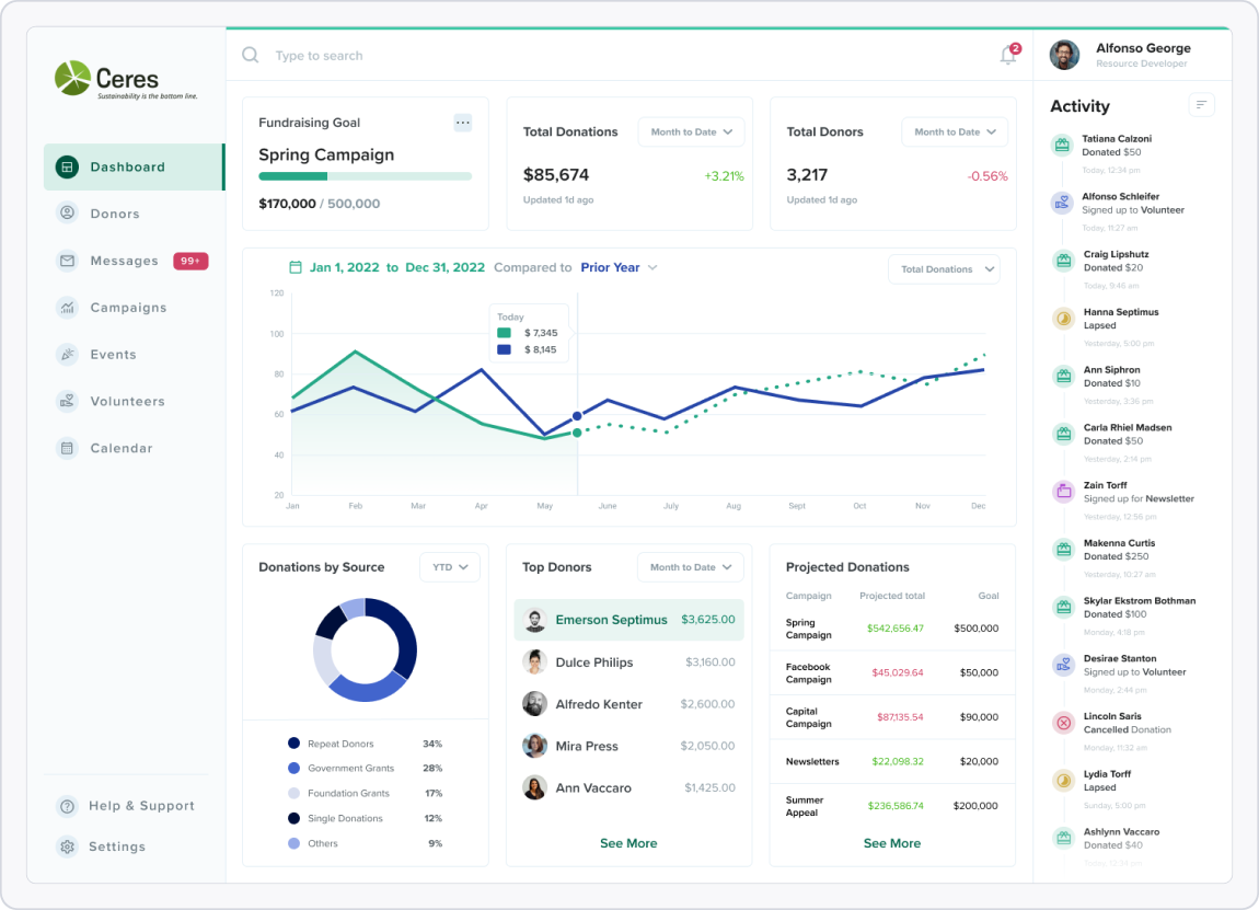
Ceres Nonprofit Dashboard

Next
Spotify Messaging Feature

