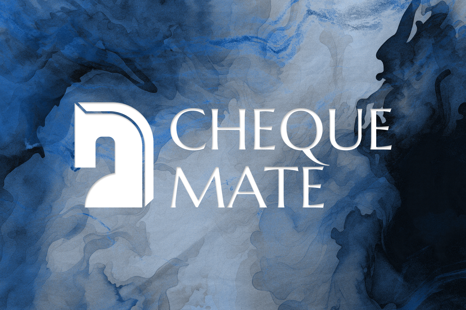
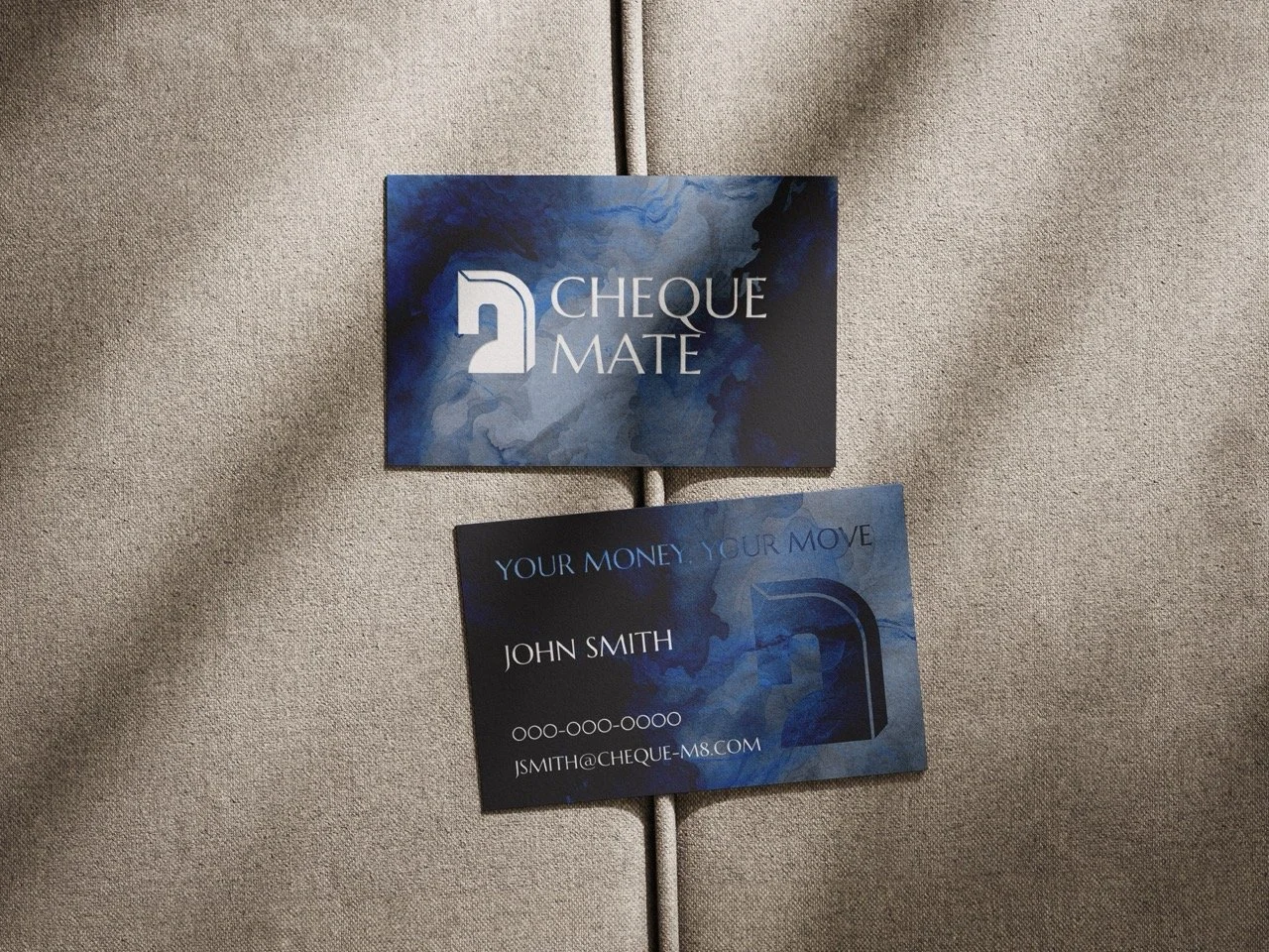
CHEQUE MATE
Client: Cheque Mate NYC
Year: 2025
Role: Art Direction, Web Design
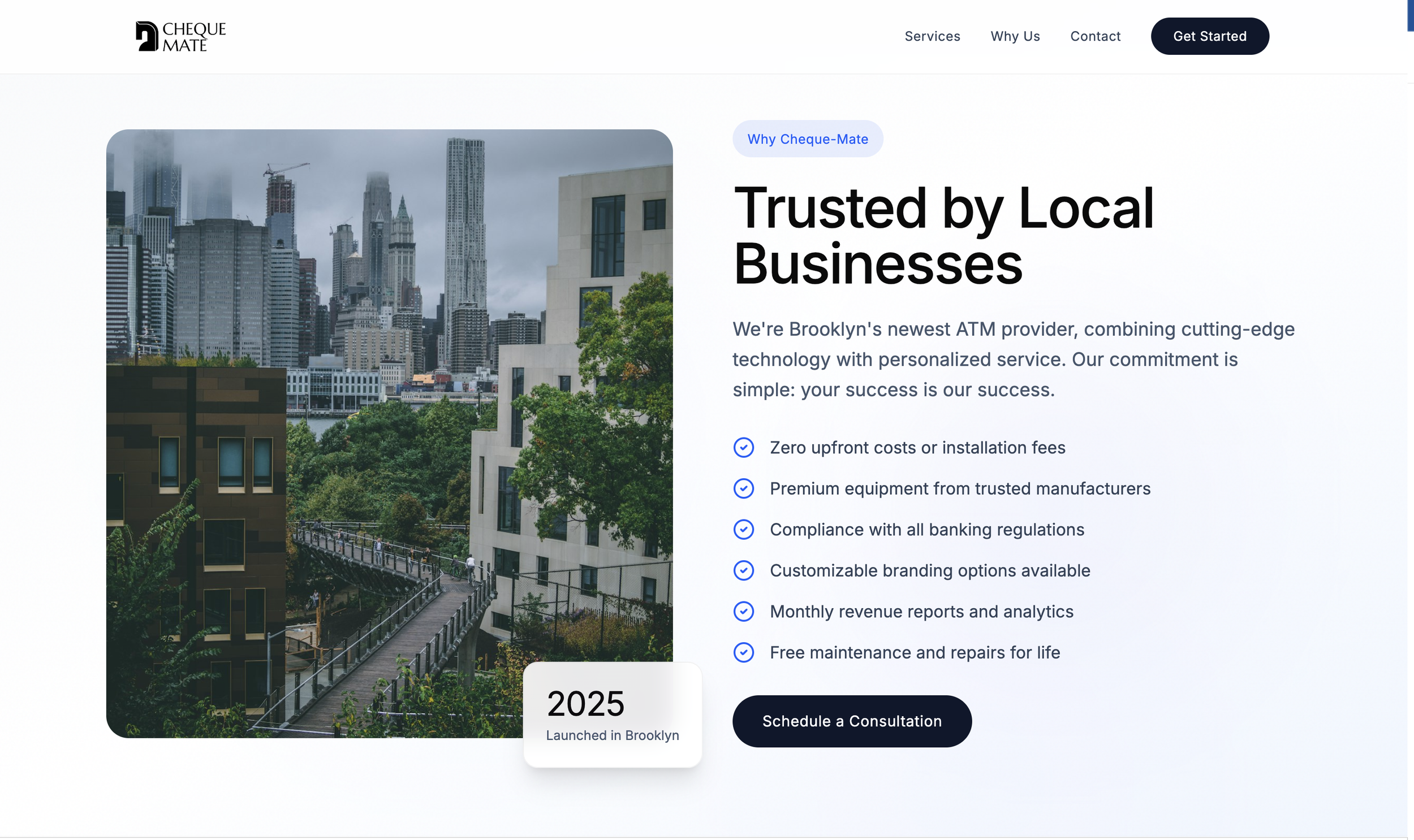
Cheque Mate is a Brooklyn, NY based company supplying businesses with ATMs in order to boost cash sales and drive engagement with local stores. In a somewhat oversaturated market, Cheque Mate seeks to establish itself as a new and reliable resource for communities through communication and trust building.
The ATM industry doesn't lend itself naturally to exciting design. The product is functional by definition, the category is largely invisible to consumers, and the businesses behind it rarely see branding as a priority. The challenge for Cheque Mate was to change that perception entirely, to create a visual identity and web presence that felt contemporary, confident, and worth paying attention to, without losing the cleanliness and professionalism a financial services client demands.
The answer began with the name. Cheque Mate is a piece of wordplay that earns its cleverness. The deliberate misspelling of "checkmate" nods to the financial world while the chess reference does something more subtle and strategic. Chess is a game of intelligence, patience, and calculated moves. It's a game where the person who thinks furthest ahead wins. For a business whose entire proposition is about putting cash access in the right places at the right time, that association is exactly right. It positions Cheque Mate not as a vendor of machines but as a strategic partner, one that knows where to move and when.
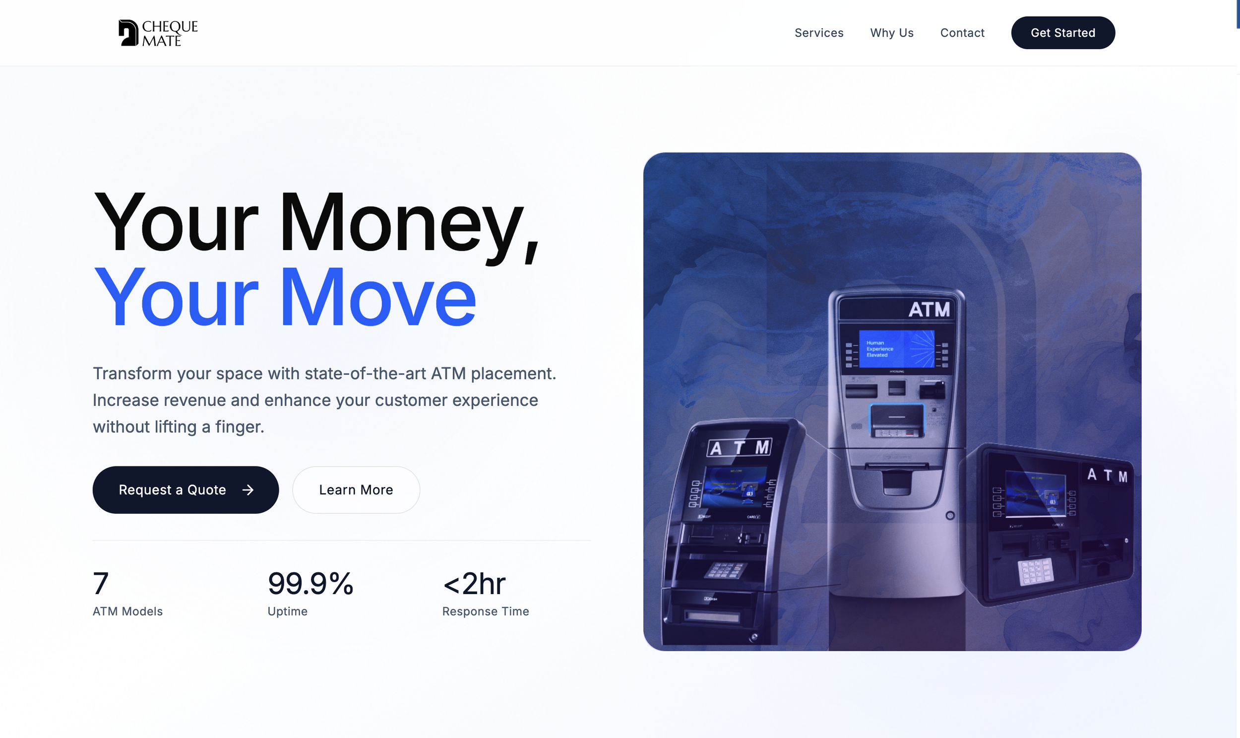
YOUR MONEY, YOUR MOVE
The tagline "Your Money, Your Move" extends that logic directly to the customer. It's an empowerment statement dressed in the language of the chess conceit, giving the end user a sense of agency and ownership over their own financial decisions. It's also rhythmically clean and confident, the kind of line that works equally well as a headline, a closing statement, or a brand mantra repeated across touchpoints without ever wearing out its welcome.
Logo Design
The logo is where the concept reaches its most sophisticated expression. Drawing from the aesthetic of the Etruscan horse, a form defined by elegance, muscularity, and a kind of ancient self-assurance, the icon avoids the stiff, heraldic quality that chess piece references can easily fall into. The use of negative space within the neck of the horse to suggest the form of an ATM is a reveal that rewards attention without demanding it. It communicates the business's core function without ever being overly literal about it.
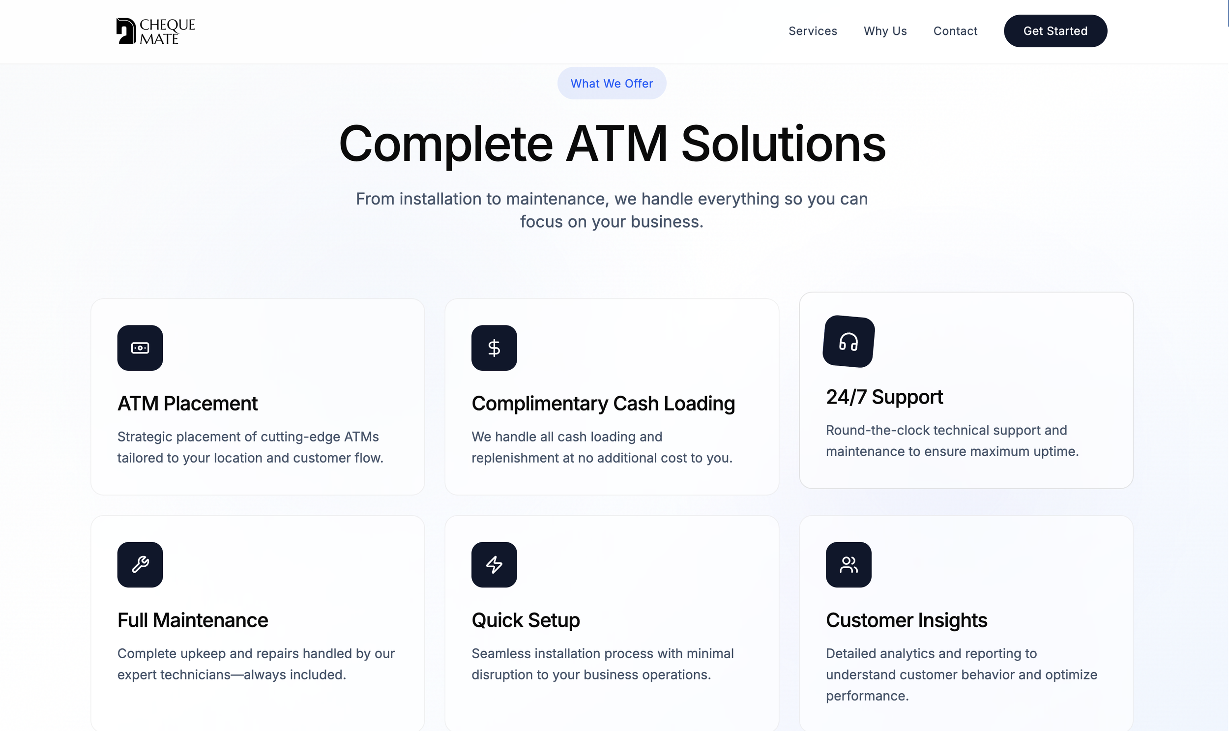
The overall design direction, clean and minimal with deliberate moments of flair, reflects the brief precisely while pushing it somewhere more interesting than the client might have expected. Cheque Mate doesn't look like an ATM company. It looks like a brand that happens to be in the ATM business, which for a company trying to win new customers in a category defined by indifference, is exactly the right place to be.
Web Design
The site is currently under construction but you can visit the previous iteration of the site below: