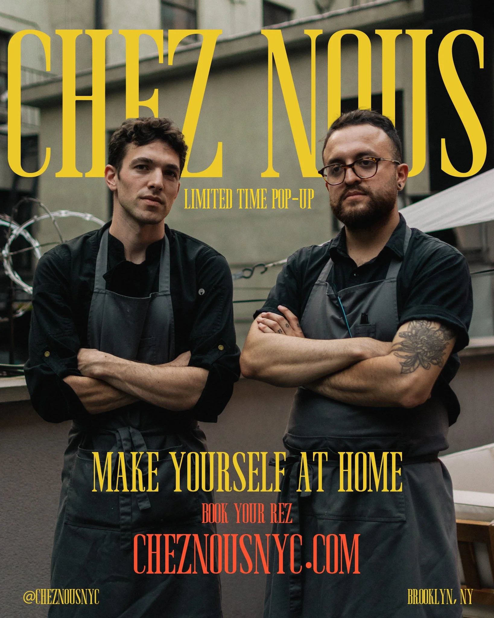
Client: Chez Nous NYC
Year: 2025
Role: Art Direction, Photography, Graphic Design, Web Design
Team: Kim Rodrig, Kevin Hermosa, Julia Mandel
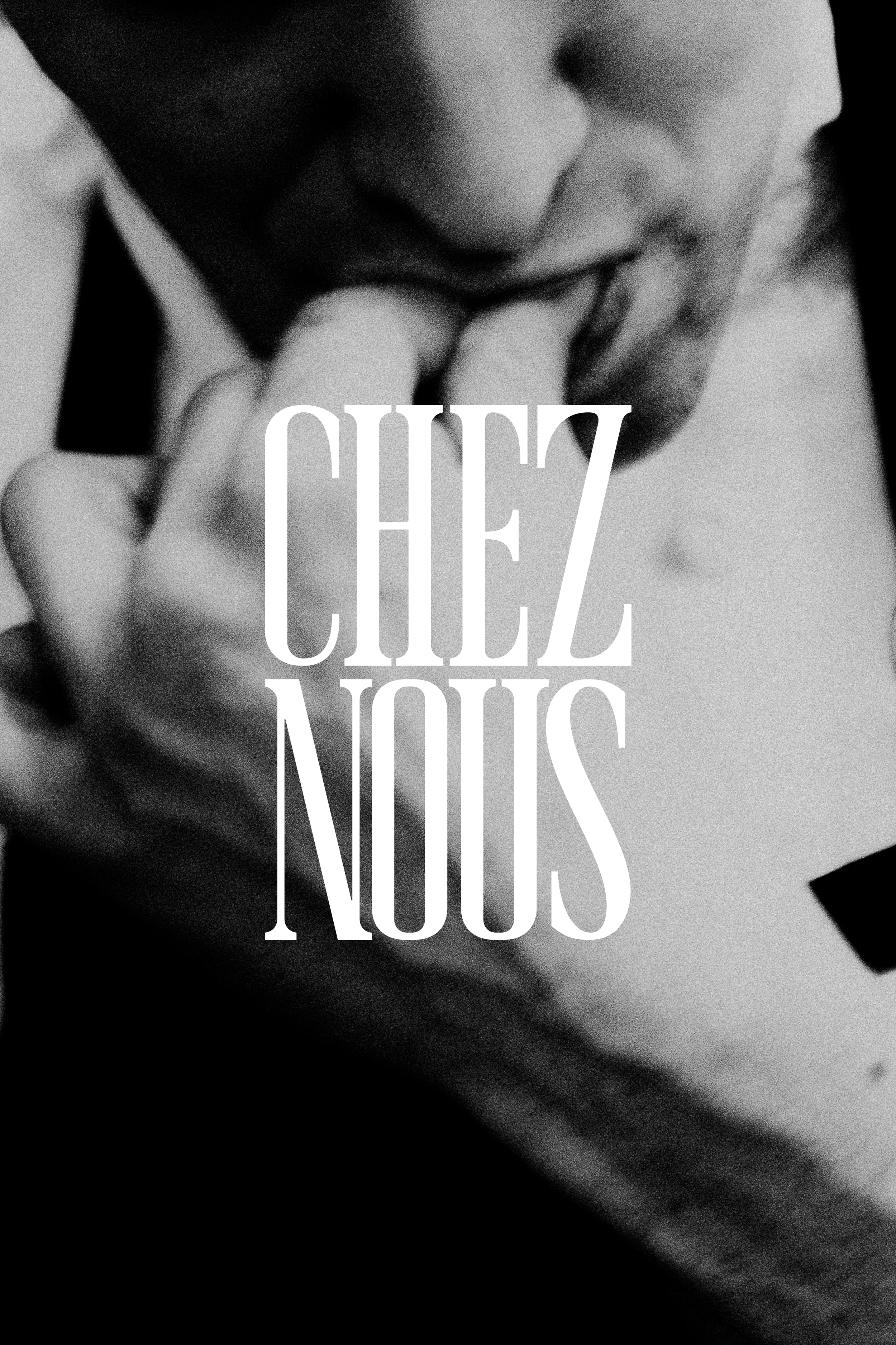
CHEZ NOUS
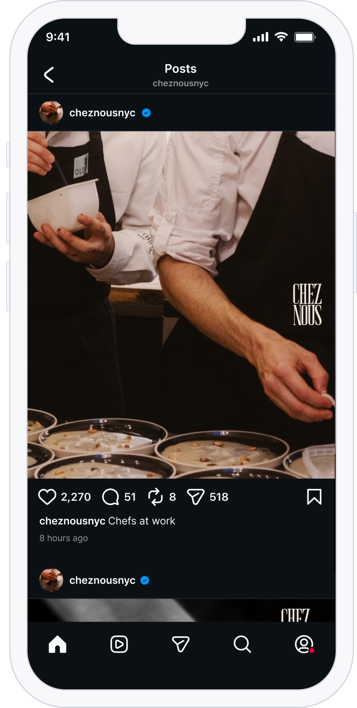
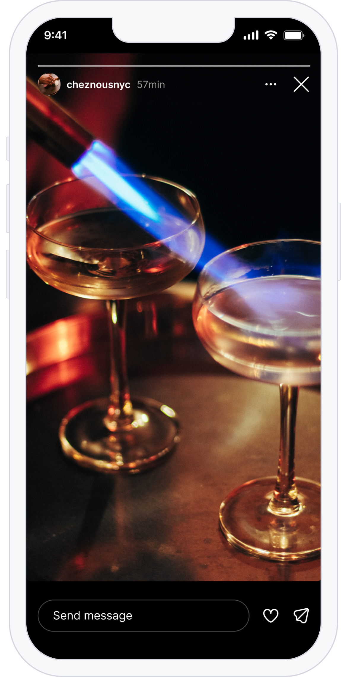
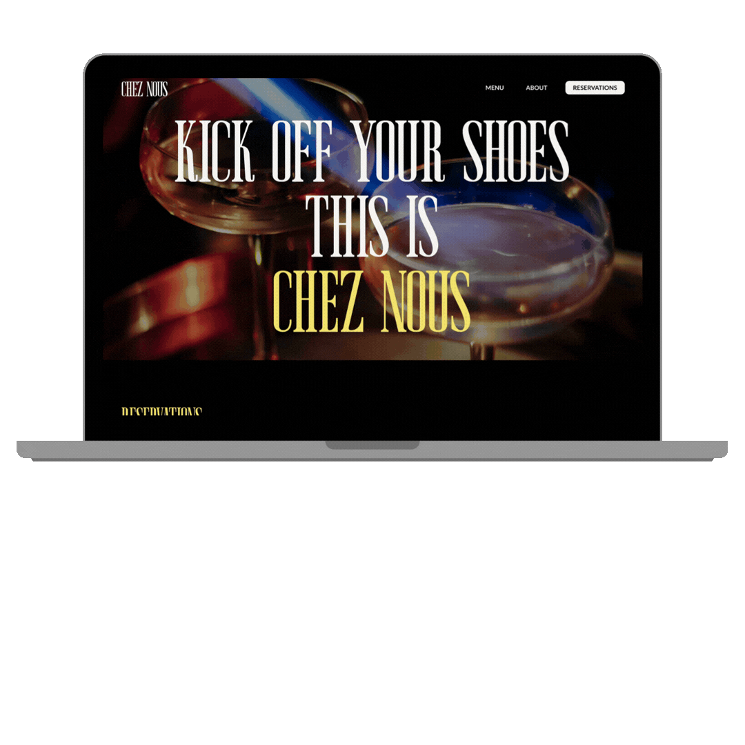
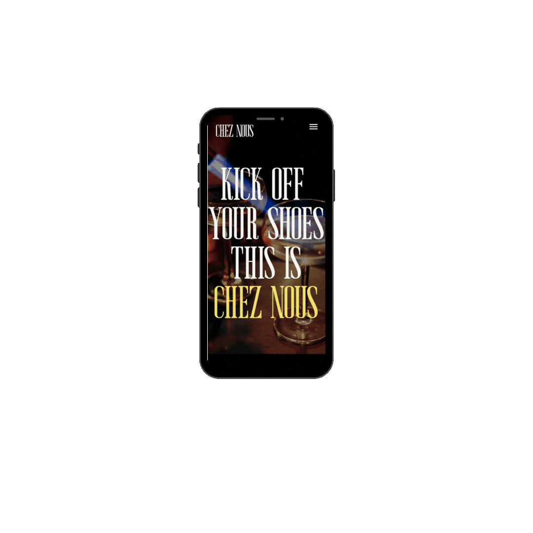
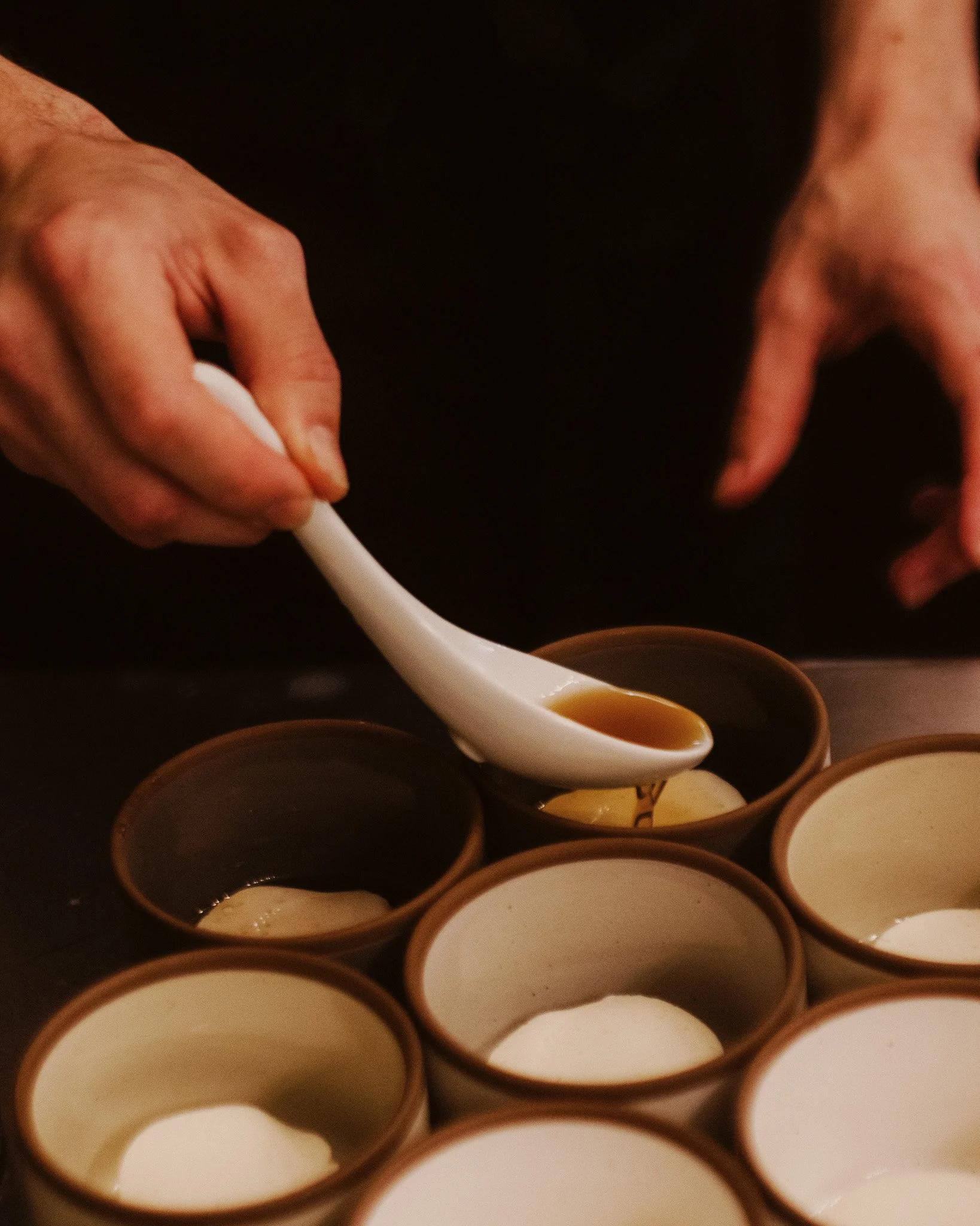
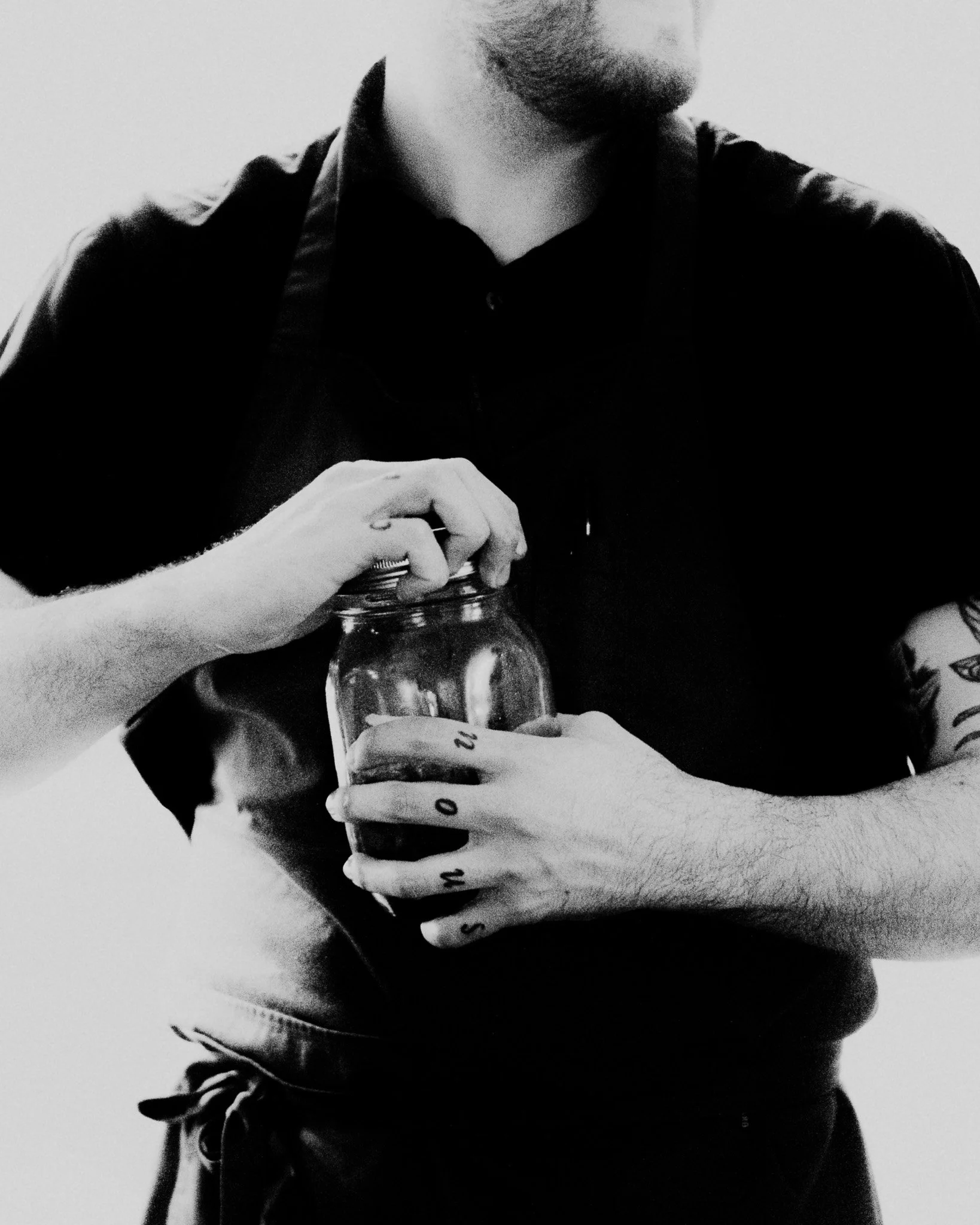
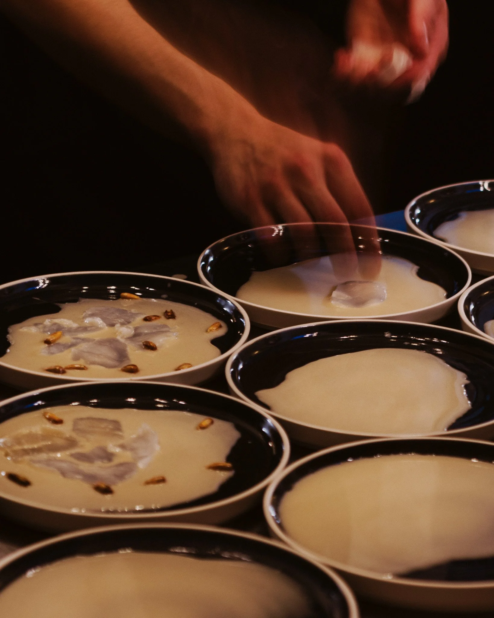
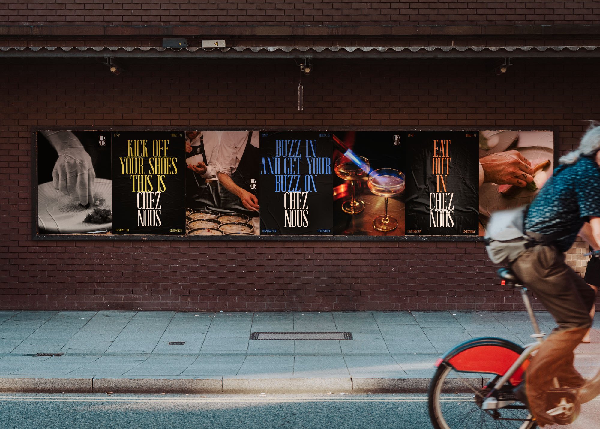
Chez Nous is a pop-up restaurant in NYC providing a full-course meal with wine and cocktail pairings, marrying Michelin experience and technique with state-of-the-art culinary tech. The dinners are hosted every few weeks, being announced primarily through social media and word of mouth. I was asked to come up with a campaign that they would use to draw in guests to make reservations.
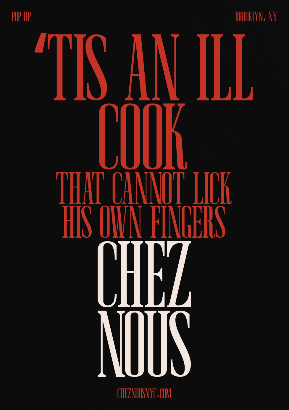
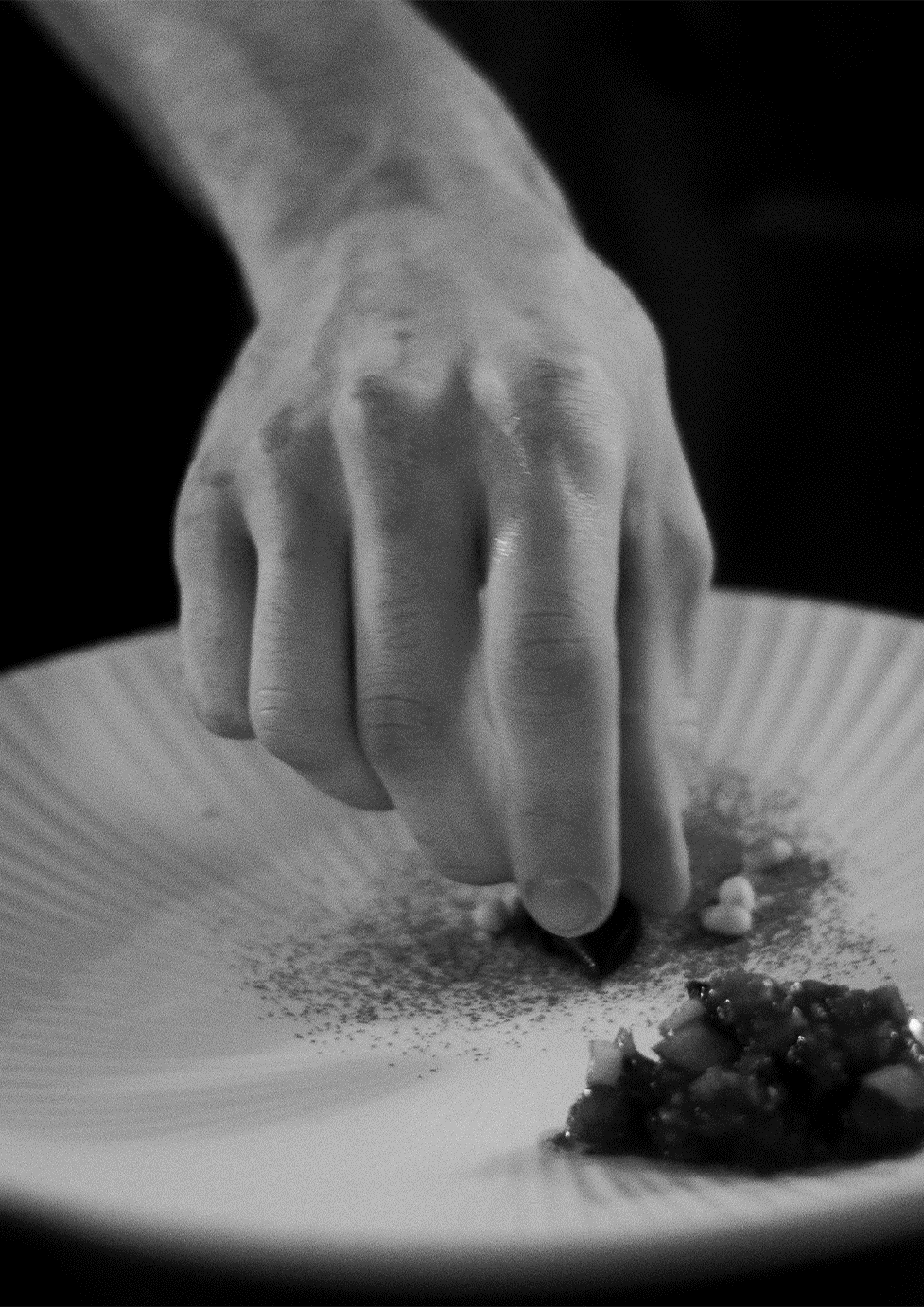
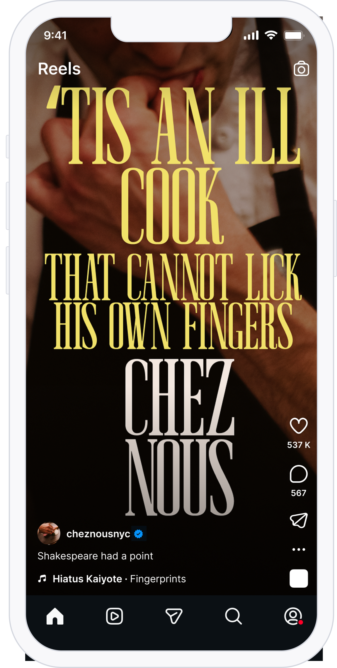
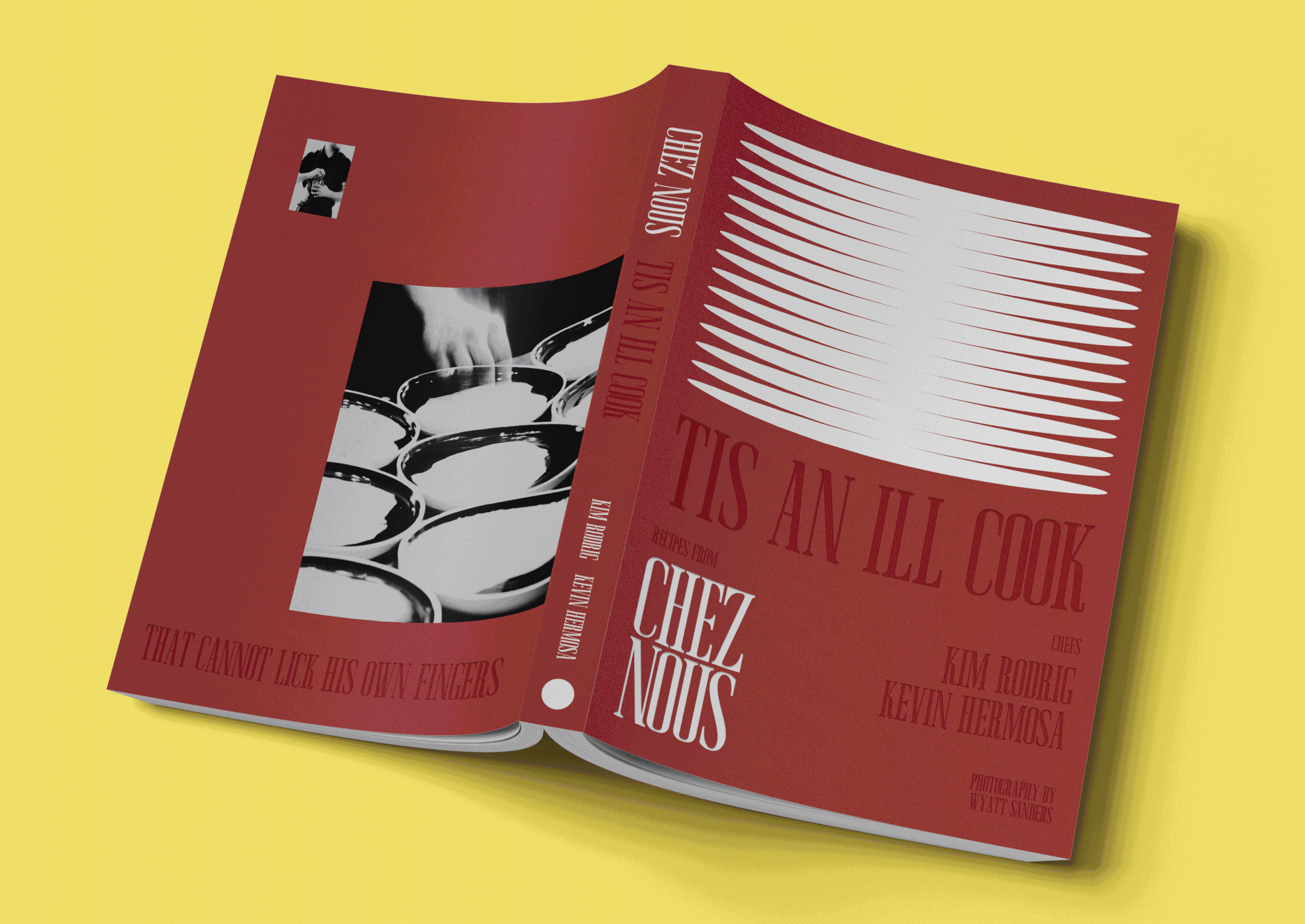
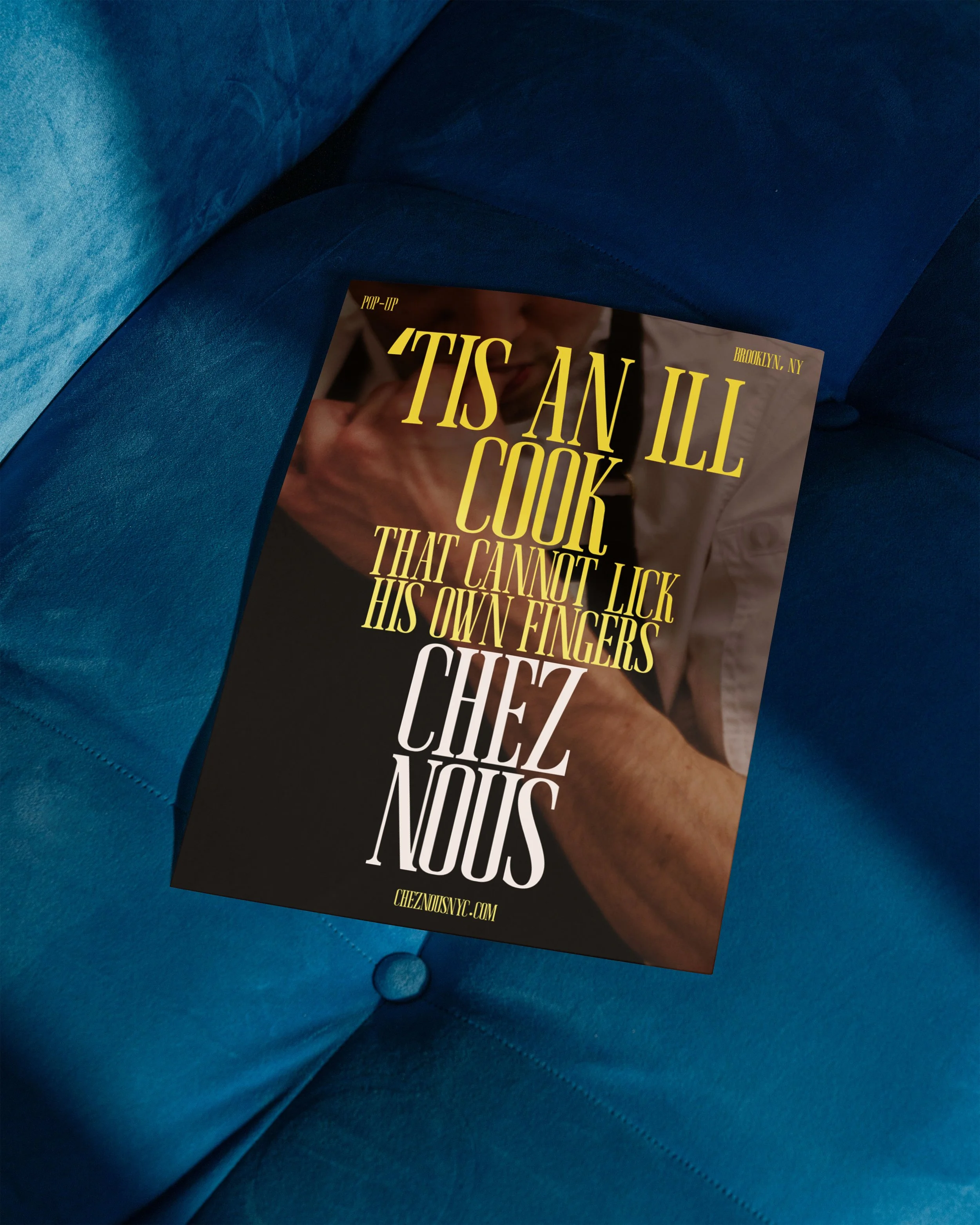
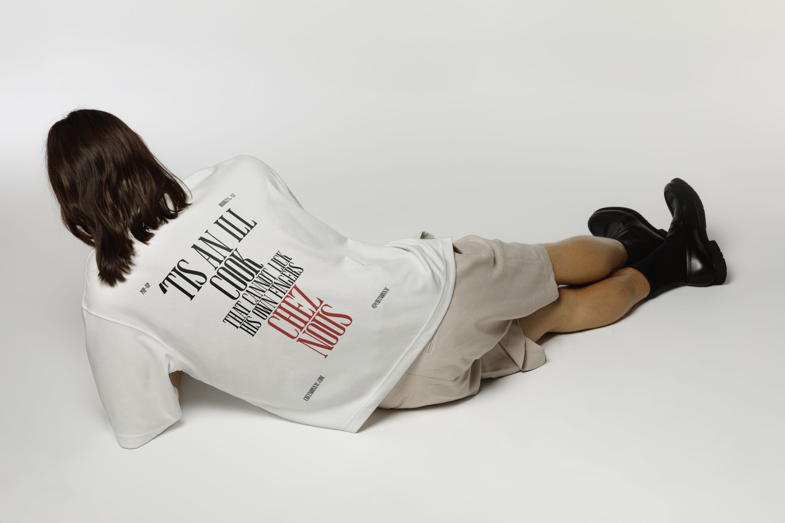
‘TIS AN ILL COOK
"'tis an ill cook that cannot lick his own fingers," from Shakespeare's Romeo and Juliet, has a simple literal meaning: a cook who won't taste their own food is a bad cook. But the deeper resonance is really about authenticity and confidence in your own work. It's essentially saying: stand behind what you create. It promises intimacy, spontaneity, and a cook who is genuinely, personally invested in what lands on your plate. The line is Shakespeare, cultured and literary, with the faint shimmer of prestige, but the image it conjures is wonderfully unpretentious, even a little messy. That contradiction mirrors what the best atypical dining experiences actually feel like: elevated but relaxed, thoughtful but unstuffy. It also carries an implicit promise of quality through conviction. A cook who licks their own fingers isn't performing for an audience. They're tasting because they care. For diners who are tired of restaurants that feel more like theater than food, that authenticity is genuinely seductive.