MATINEE CHOCOLATE
Client: Matinee Chocolate Co.
Year: 2024
Role: Art Direction, Graphic Design
Building a visual identity from the ground up is one of the most demanding and rewarding challenges in design. When Matinée, a handcrafted, organic, and vegan chocolatier, came looking for a brand identity at the very earliest stage of the venture, the opportunity was as much about establishing a feeling as it was about creating a logo. The work encompassed the full visual identity system: logo, typography, color palette, and supporting graphics, developed iteratively through preliminary user testing and refined through multiple rounds of pivoting and adjustment as the brand found its shape.
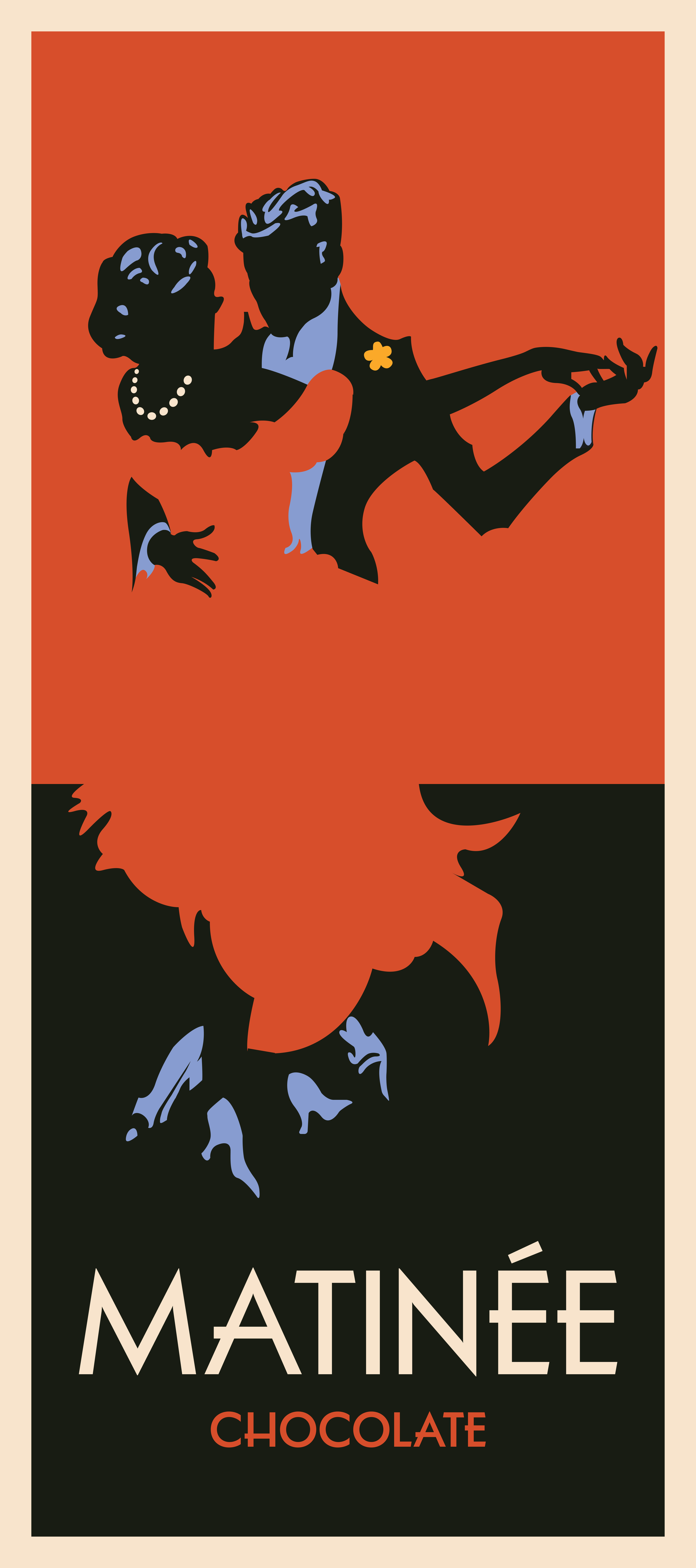
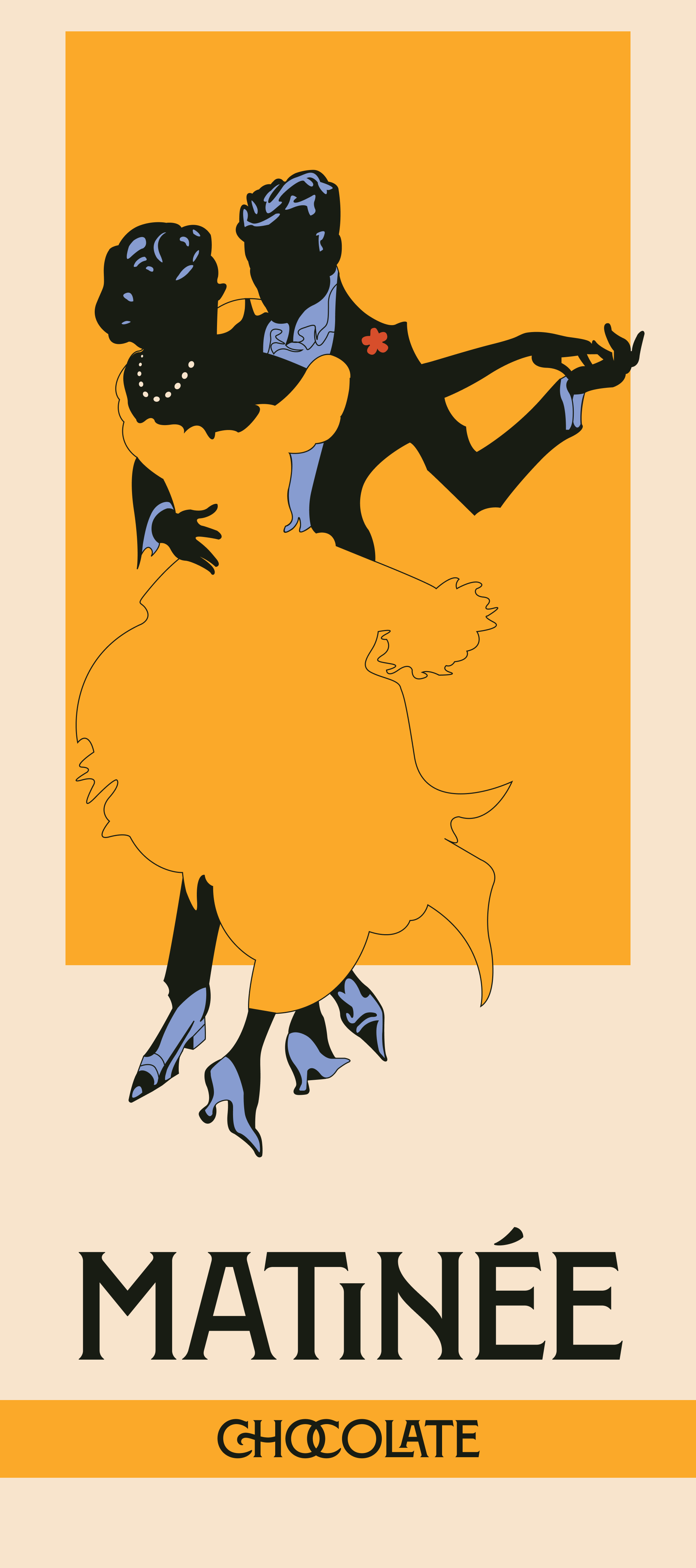
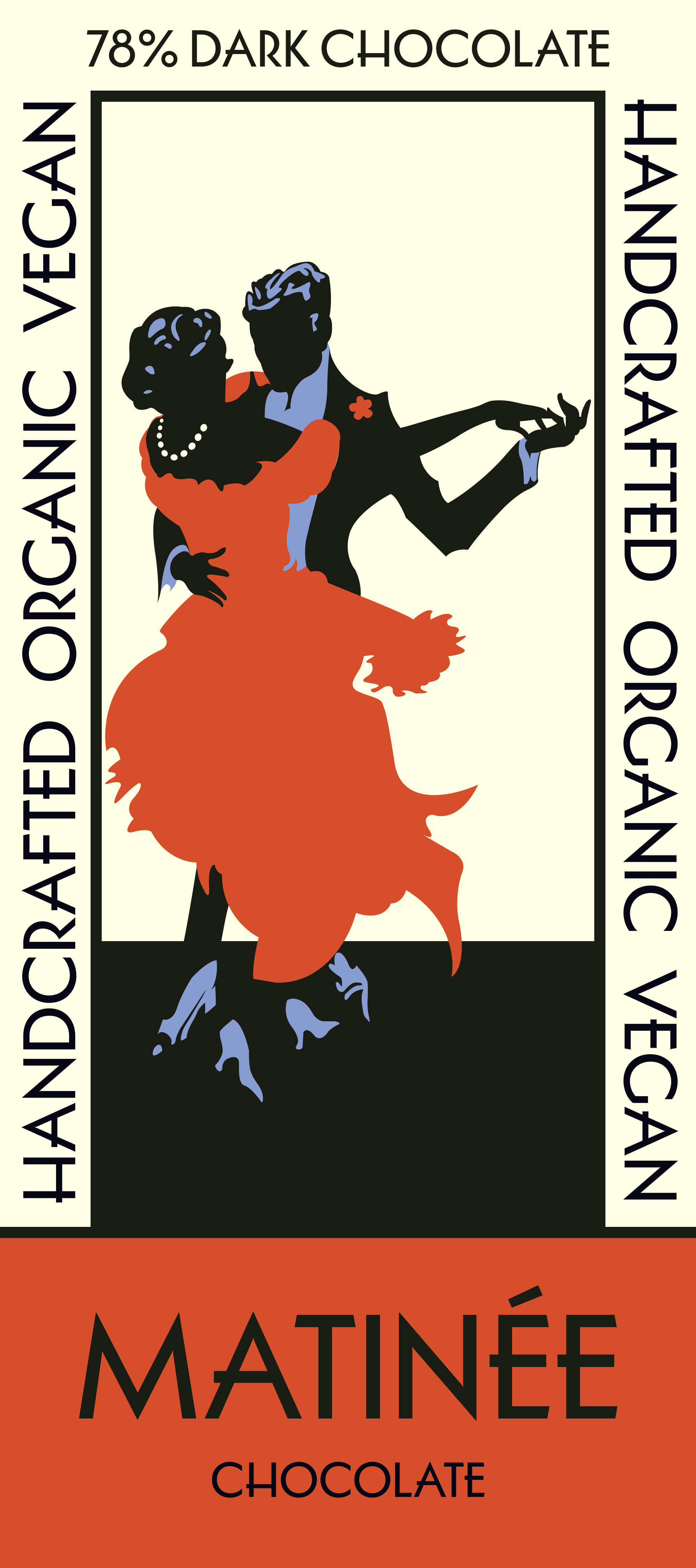
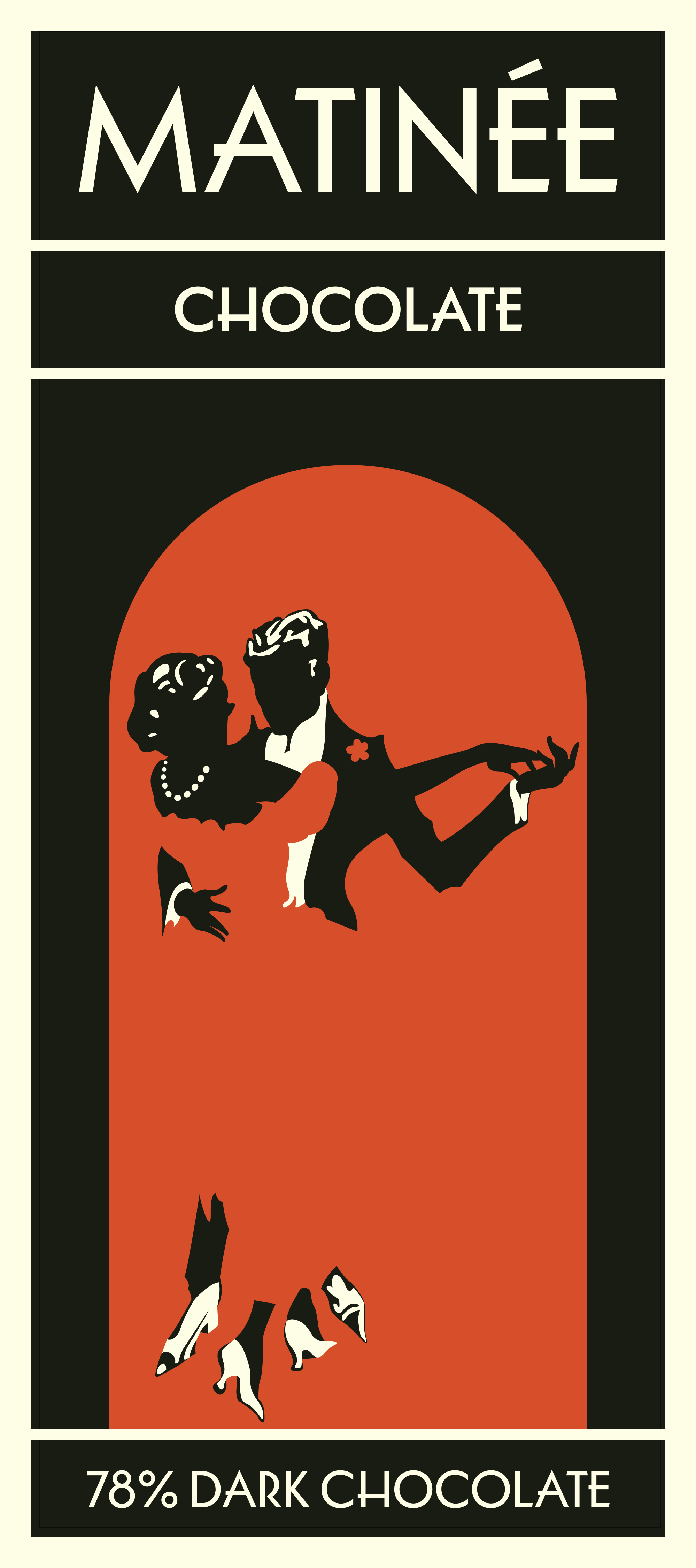
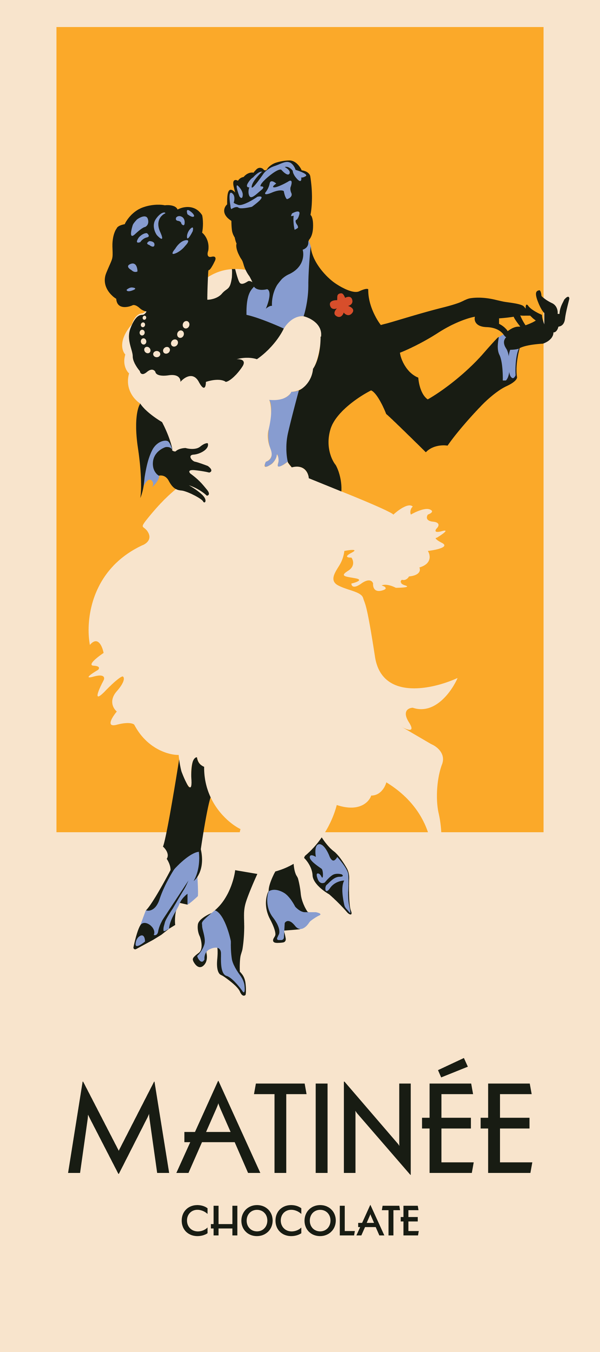
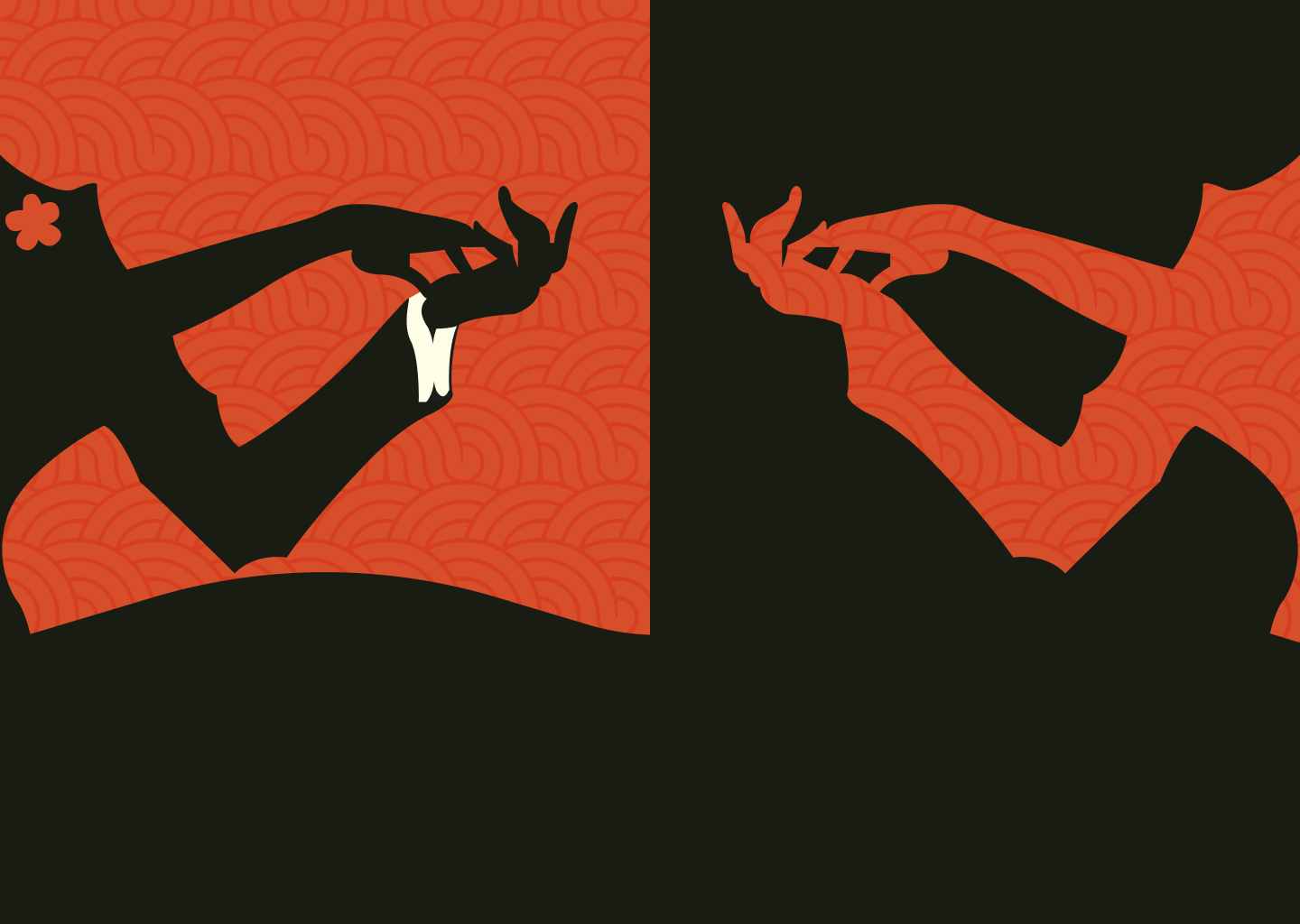
The creative direction was rooted in a single word: joy. Matinée, as a name, carries with it the warmth of a little afternoon show, a midday pleasure, something indulgent and unhurried. That spirit became the foundation for every visual decision. The central logo image of two figures dancing, rendered in a cutout aesthetic, captures that feeling immediately. It's celebratory without being loud, intimate without being precious, and it positions chocolate not as a guilty pleasure but as a natural companion to life's more joyful moments.


The typographic system reinforces that vision with equal care. Marseille, used for the wordmark, was chosen for its direct evocation of classic French product posters, particularly the alcohol and aperitif advertising of the late nineteenth and early twentieth centuries. Those posters understood instinctively that the best way to sell something pleasurable was to show pleasure itself: dancing, gathering, the easy happiness of people enjoying one another's company. Poppins, used for supporting text, brings a clean modern contrast that prevents the identity from feeling like pastiche, grounding the nostalgic reference in something contemporary and accessible.
The color palette of reds, yellows, and neutral tones completes the picture. Warm and inviting without being saccharine, the palette echoes the richness of the product while maintaining the sophisticated restraint the brand requires. Together the colors, typography, and imagery create an identity that feels at once timeless and fresh, rooted in a recognizable visual tradition but never beholden to it.
Matinée is a brand built around the idea that good chocolate, like a good afternoon, deserves to be savored. The identity system exists to make that argument before a single piece of packaging is ever opened.
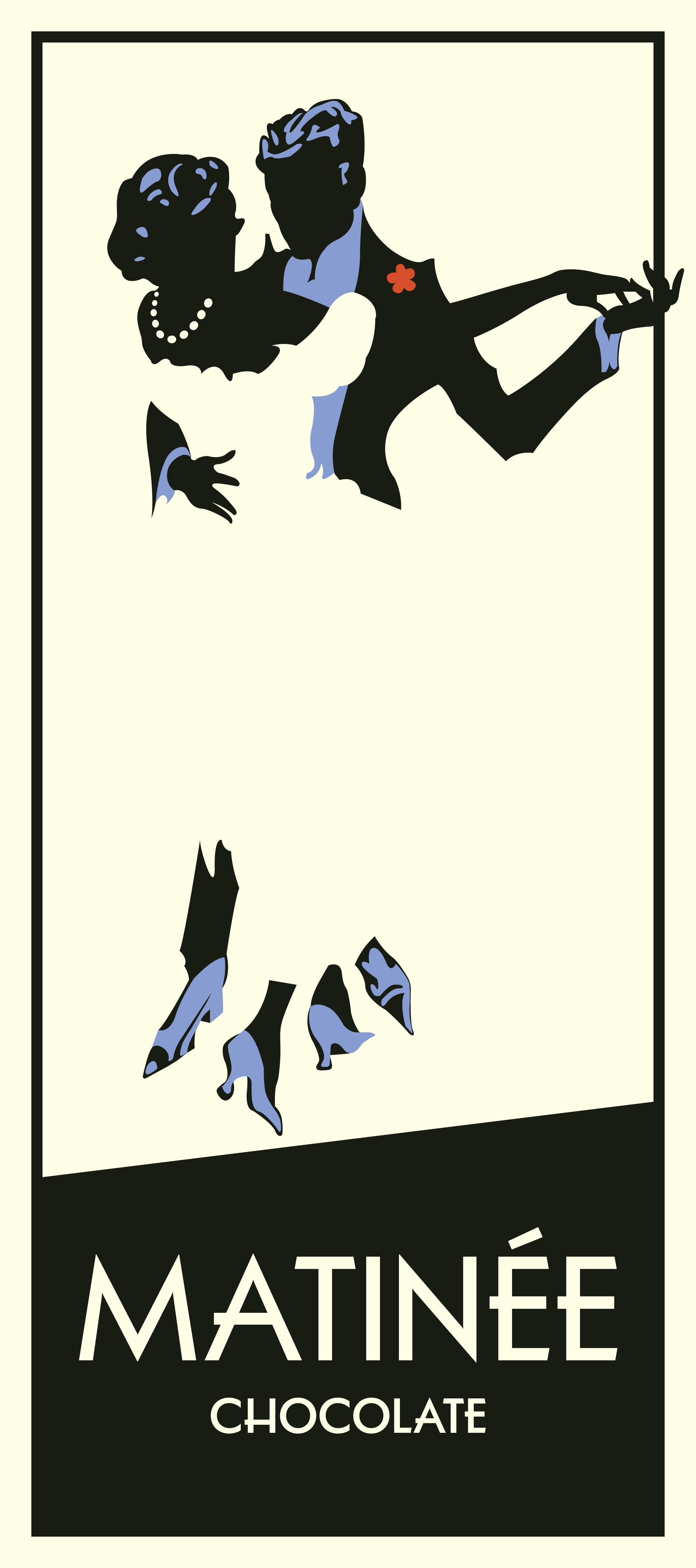
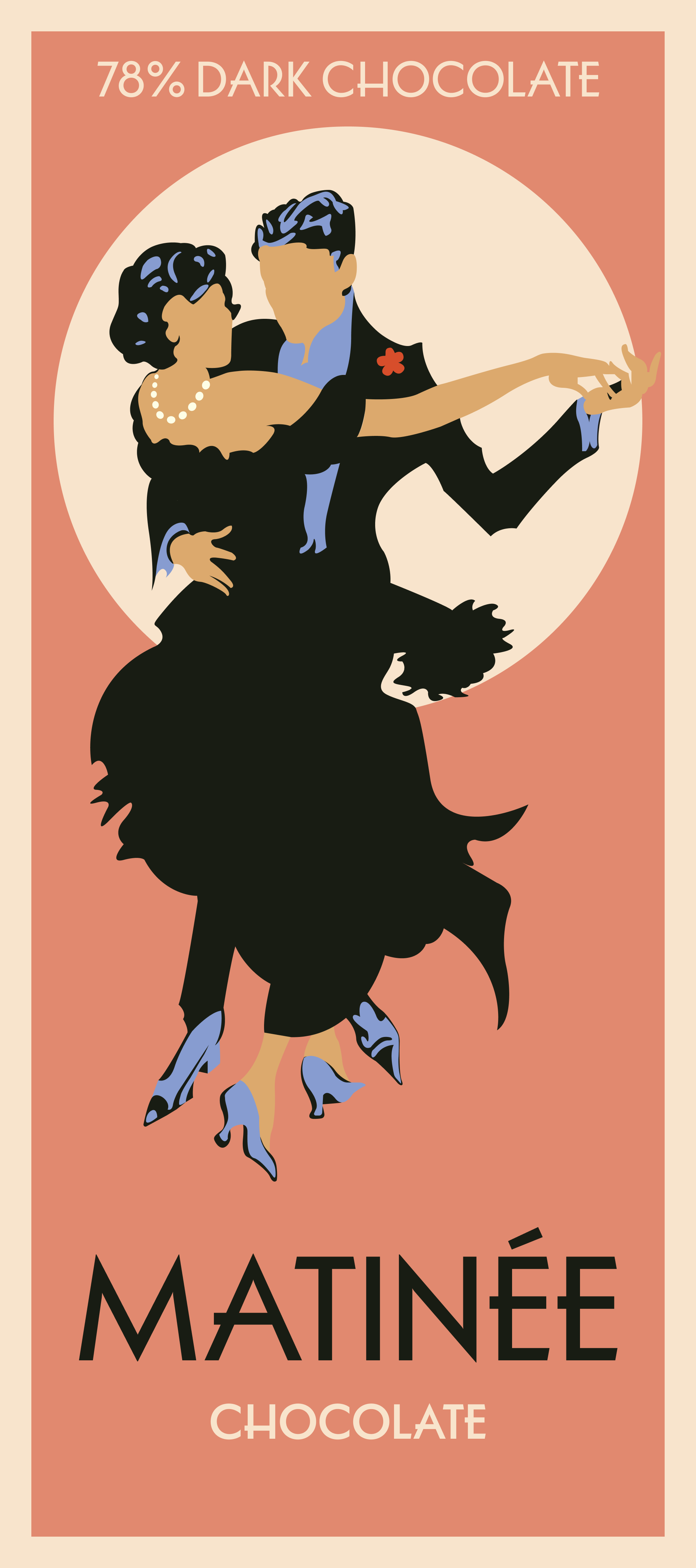
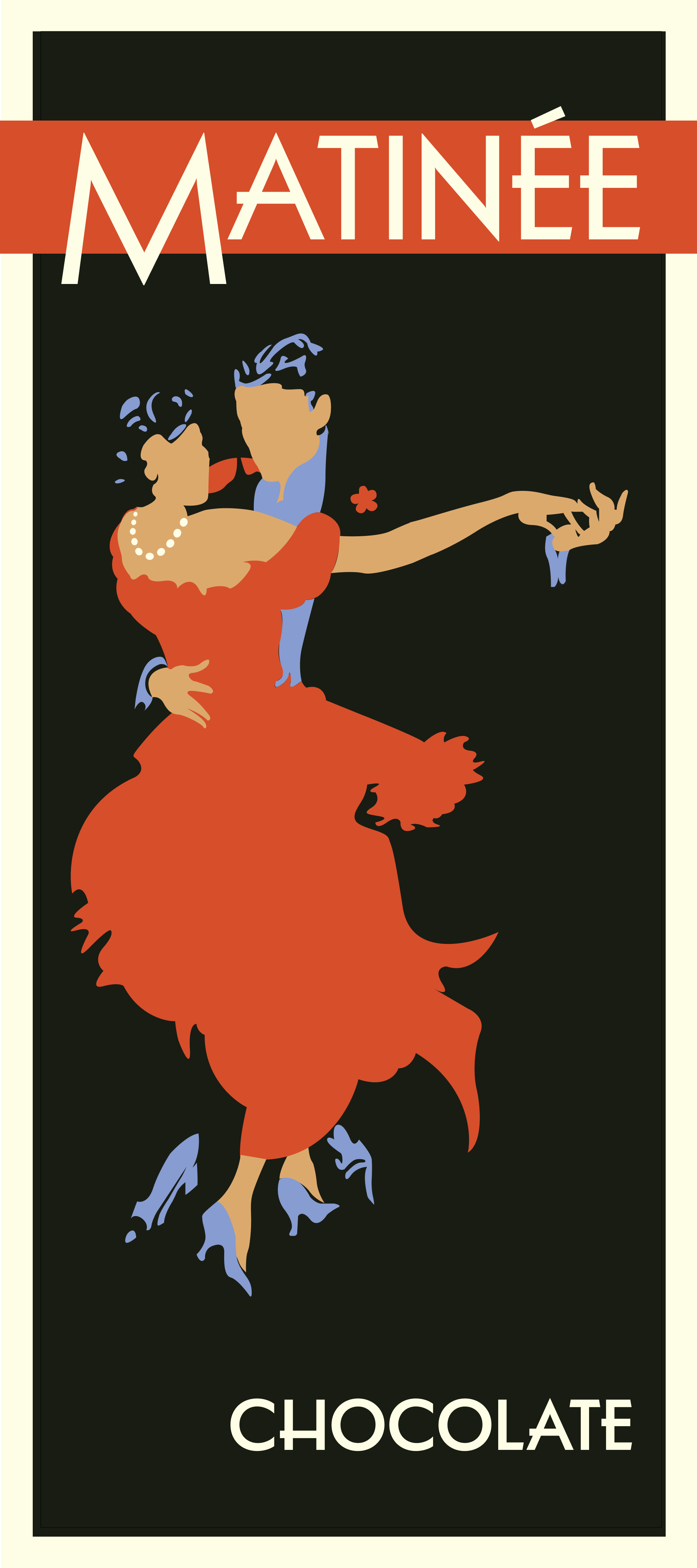
ALTERNATE DESIGNS